Introduction: The Mission
The Nature Conservancy (TNC) is currently global leader in environmental conservation, impacting 83 countries with a mission to protect the lands and waters on which all life depends. However, a non-profit’s mission is only as strong as its ability to engage supporters.
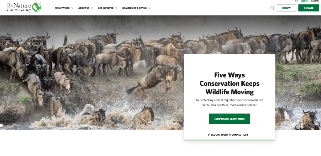
This semester-long research project focused on nature.org, identifying where the user experience (UX) succeeds in storytelling but falters in functional utility. The goal for this project was to streamline the path from visitor to supporter by identifying and removing digital pain points.
The Research Process: Understanding the User
To move beyond assumptions, a multiple research strategies were introduced to evaluate how effective the site currently is.
1. Competitive Analysis & Personas
How does TNC stack up against organizations like the World Wildlife Fund (WWF) or Sierra Club? The analysis revealed that while TNC has superior scientific content, competitors often provide a more direct path to pursue action.
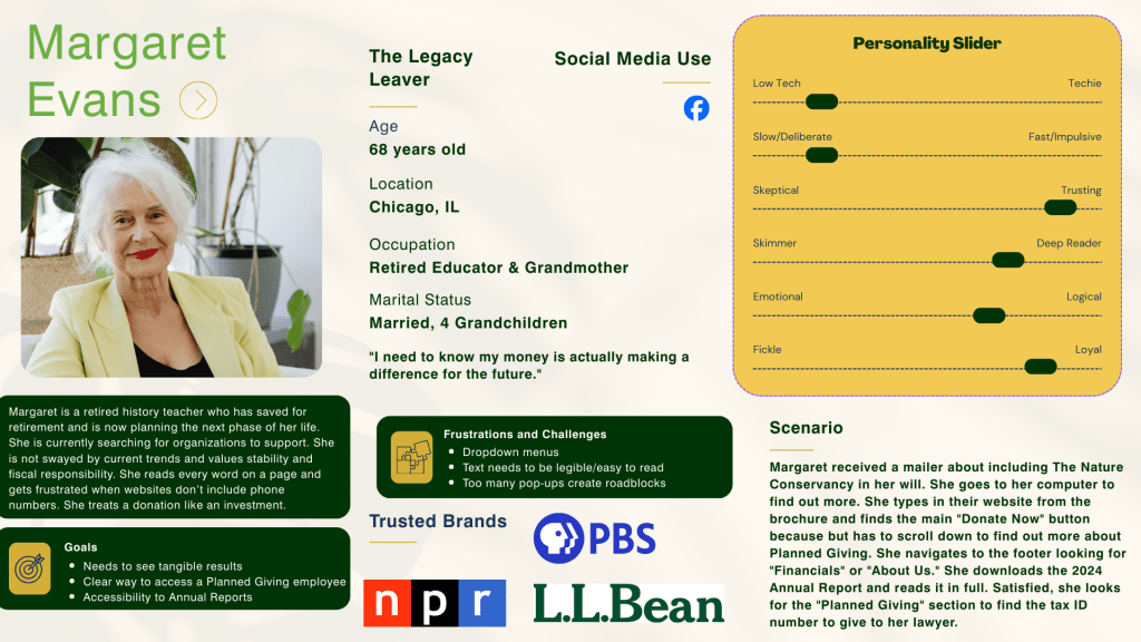
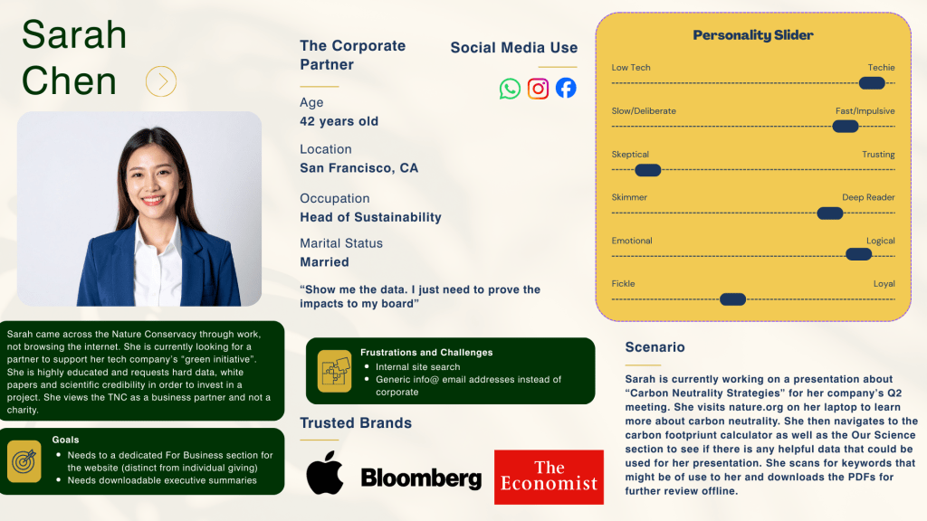
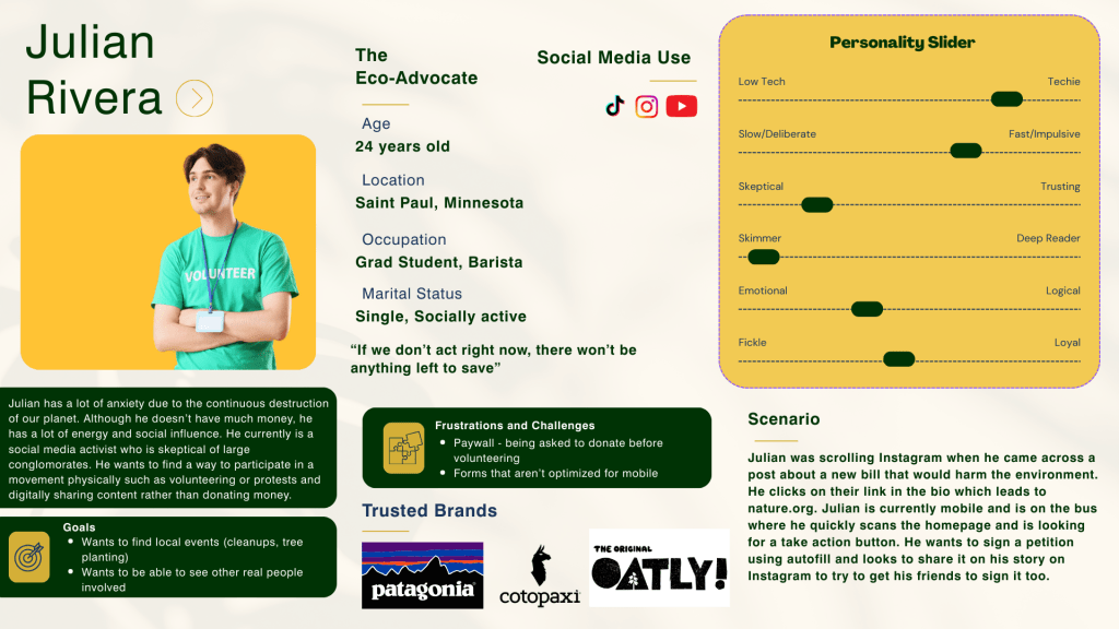
To anchor the design decisions, three key Personas were developed:
- The Donor: Needs transparency and ease of financial contribution.
- The Advocate: Seeks immediate action.
- The Corporate Partner: Requires fast access to data.
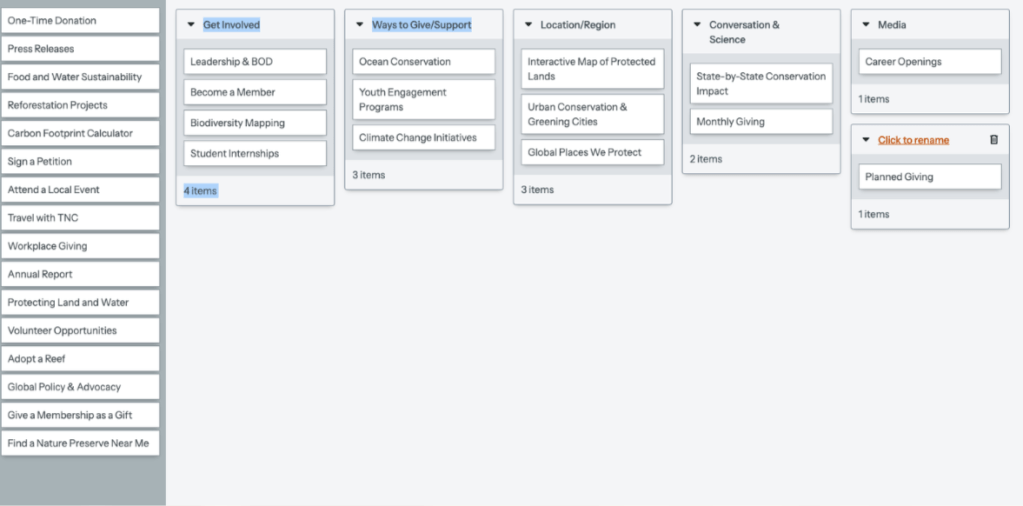
2. Information Architecture & Card Sorting
One of the primary challenges identified was Cognitive Overload. Through performing Card Sorting exercises, it was discovered that users categorized Act and Get Involved differently than the current site structure. This data provided a roadmap for a simplified navigation menu.
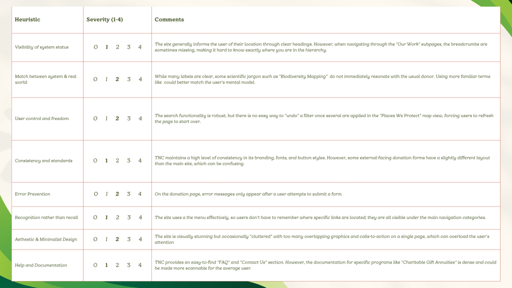
Identifying Friction: Heuristic Evaluation
Throughout the case study, the site was audited for consistency and error prevention.
Here were the Key Findings:
- Aesthetic and Minimalist Design: The site is beautiful but suffers from a mega-menu that overwhelms the user and often caused confusion.
- Flexibility and Efficiency of Use: Expert users (donors) have to click through too many layers to find specific documents.
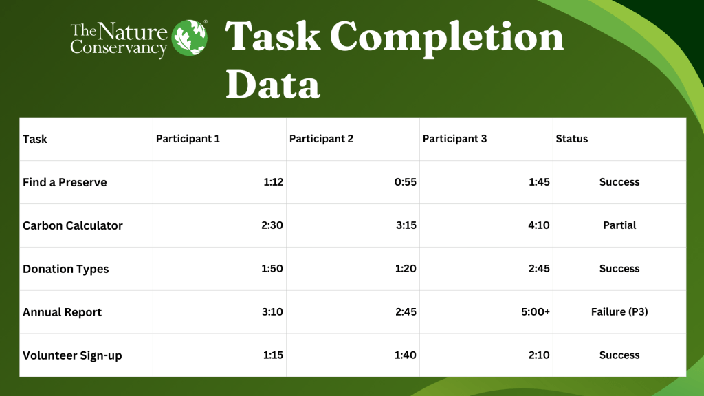
Testing the Theory: Usability Results
The most critical phase involved direct Usability Testing. Participants were asked to complete high-value tasks, such as finding a local nature preserve and locating the Carbon Footprint Calculator.
During testing, multiple users struggled to find the Annual Report. Despite being one of TNC’s most crucial documents, it was “hidden” under layers of navigation. This confirmed that the site’s Information Architecture was hindering one of its best engagement tools.
The Solution: Strategic Recommendations
The research culminated in a series of design recommendations aimed at improving conversion and retention:
- Simplified Navigation: Reduce the primary menu options to five core categories to decrease decision time.
- Action-Oriented Hubs: Pull local volunteer events and interactive tools together into a single “Take Action” dashboard.
- Enhanced Transparency: Move the Annual Report to the footer and main “About” menu to build immediate trust with new donors.
- Mobile Optimization: Implement persistent navigation to assist users on long-form science articles.
Conclusion: Data-Driven Design
At the end, this project demonstrated that even the most mission-driven organizations must prioritize UX Design to achieve their goals. By aligning TNC’s business needs with the actual behaviors of its users, the website can become more than a brochure, but rather a powerful engine for global conservation and achieve greater things. Please feel free to browse the full document below for more information.

Leave a comment