According to the Interaction Design Foundation, “Usability testing is the practice of testing how easy a design is to use with a group of representative users.” As designers, we often become familiar with a project we are working on that we begin to develop blind spots, believing certain navigation paths or labels are “the only way.” This testing session I recently conducted with TNC proved that real users indeed do think differently than designers, and what seems apparent to us is often a barrier to others.
The Mission: Testing The Nature Conservancy (TNC)
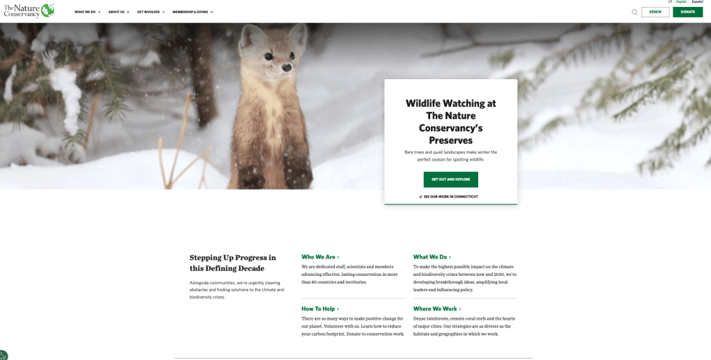
This week, I conducted usability testing sessions on The Nature Conservancy’s website. Given TNC’s massive digital footprint, the goal was to figure out how the current interface facilitates major user journeys such as local engagement, interactive tools, and financial contributions. I wanted to move beyond assuming and observe natural problem-solving behaviors by introducing test subjects to the mix.
The Methodology
Following the principles outlined in Steve Krug’s Usability Test Demo video, I recruited three participants that I had handy to represent diverse user personas: a Local Explorer, a Philanthropist, and an Information Seeker. The sessions were conducted remotely via Zoom. I used a standardized script to ensure that the study remained consistent, and maintained a passive role during the tests to observe natural behaviors without influence.
The Setup: Prep Materials
To maintain ethical standards, these preparatory materials were developed:
- Facilitator Script: Ensures that all participants receive the same introduction, pre-test questions, and task scenarios.
- Consent Form: Participants formally agreed to this study.
- Post-Test Interview: Questions designed to capture final impressions of the experience.
The Tasks
In this experiment, participants were asked to complete five realistic scenarios that tested the critical user flows of TNC’s website:
- Local Engagement: Locate a nature preserve within 50 miles of their zip code.
- Interactive Tools: Find and start the Carbon Footprint Calculator.
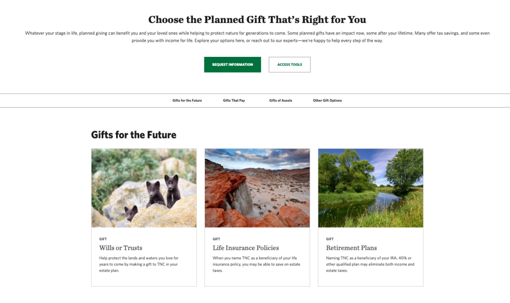
- Philanthropy: Determine difference between a Monthly Gift versus Planned Giving
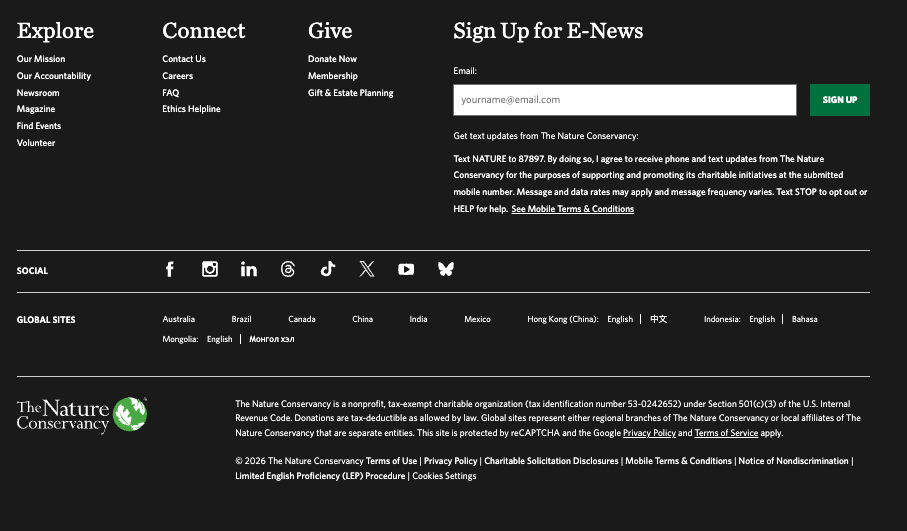
- Financial Transparency: Locate the most recent Annual Report.
- Direct Action: Find the sign-up page for local volunteer events.
Key Findings and Observations
Overall, the sessions were enlightening, they revealed that while the site is visually stunning, it often suffers from an overloaded navigation that confuses the average user.
1. Financial Jargon Confusion (Task 3)
A major barrier that was prominent was during the donation tasks. The technical label of “Planned Giving” consistently caused participants to pause, with one user initially misinterpreting it as a schedule for recurring donations rather than estate planning. Participants favored clearer, more “action-oriented” terminology.
3. The Search for Transparency (Task 4)
Locating the Annual Report proved to be a more difficult task than expected. Participants expected the doc to be easily accessible under “About Us,” but the dense information architecture of the footer made it difficult to find. One participant nearly abandoned the task because it was so difficult to find!
Recommendations for Improvement
Based on the data gathered, the following adjustments are recommended to enhance TNC’s usability:
- Simplify Terminology: Replace jargon like Planned Giving with accessible terms like “Legacy Giving” or “Wills & Estates.”
- Prioritize Transparency: Make the Accountability section more prominent
Conclusion
Testing The Nature Conservancy confirmed that a beautiful design cannot compensate for a confusing user path. By listening to how users actually think and navigate, TNC can lower the confusion and convert more visitors from passive information seekers into active contributors towards their mission.

Leave a comment