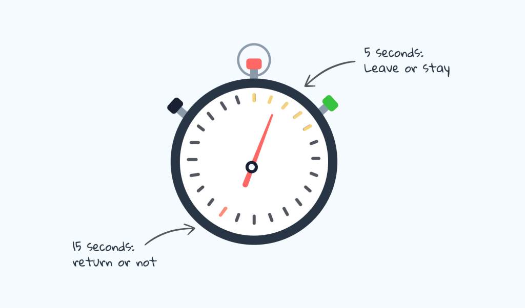
A lot can happen within 5 seconds. In the world of UX design, first impressions are extremely important. According to the Association of Psychological Science, a first impression is formed within a tenth of a second, let alone five seconds. To effectively test if one’s design can communicate their primary message in such a short amount of time, researchers and designers use the Five Seconds Test to see if the message is communicated correctly.
Jay Eskenazi mentions in his article “How to fix the 5 most common mistakes in focus groups” the concept of the Vividness Effect. This phenomenon explains that the vividness of an event can affect the one’s ability to recall/remember one’s memory of the event. A perfect way to measure this in a scientific setting is conducting the Five Seconds Test as it is a rapid-fire exercise that doesn’t give the user time to think of another answer. The subject’s answer should come clearly and naturally.
How to perform a Five Seconds Test
Conducting this test is fairly clear and simple. Nick Babich explains in his video succinctly on the steps and purpose.
- Invite participant to testing area
- Decide what visual/aspect you want to be tested
- For example: webpage, logo, etc..
- Reveal the image for 5 seconds
- Hide the image from view after the time allotted.
- Ask follow-up questions to gauge first impressions such as:
- What is the main thing you can recall?
- What was your impression of the design?
- Can you describe the design after viewing the page?
After collecting this data, the results should show the participants’ true unbiased first impressions and gut reactions. This in turn will help us identify if the content shown is clear and concise and achieves the main purpose.
Tools Needed
There are several ways to perform this test and the experiment can be as simple as a stopwatch and a piece of paper! However, a tool that might be helpful to acquire for this test is Figma as it is perfect for drafting high-fidelity mockups and extremely versatile.
Research Examples
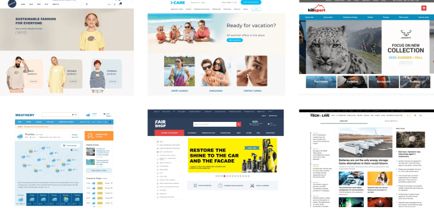
In this example, researchers were trying to determine if a website’s homepage design had an effect on one’s first impressions. Edward Kuric found that those users who liked the “modern” aesthetic of a website could not identify the company’s core services which in turn proved that a prettier design often creates distractions. The team later on decided to simplify the website’s features to ensure that the main goal of the site remains at the top.
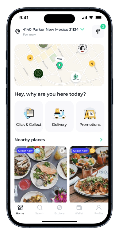
Maze’s article goes into the nuances of the five second test and bing about an example of a simple redesign for an app called ‘Places’. The goal of this five-second test is to determine if the message is clear enough for the users to understand and speak directly about the product’s selling point. They tested two variations of the landing page: one had a huge hero image while the other had a bold headline. In the end, they found that the headline version led to a larger percentage recall of the brand name.
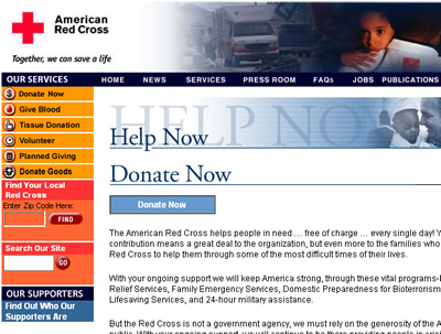
RedCross.org wanted to test their Donation content page to see if users coud determine what would be the most important features of the page within five seconds. This page is of large importance because if their goals fail, hundreds of thousands of dollars can be at risk as the conversion rate drops. By asking users “What is the most important information on this page?” and “How would you go about donating to the Red Cross?” This simple test can identify whether or not a content page is clear and concise.

Leave a comment