
At the end of the day, maps are built to depict a relationship, whether the map is the truth or not is a different conversation. In The Truthful Art, by Alberto Cairo, the author quotes Reif Larsen defining that “a map does not just chart, it unlocks and formulates meaning; it forms bridges between here and there, between disparate ideas that we did not know were previously connected.”
Using some of data that I cleaned up last week, I wanted to put my map building skills to the test and create three maps: A Locator Map, Choropleth Map, and a Symbol Map.
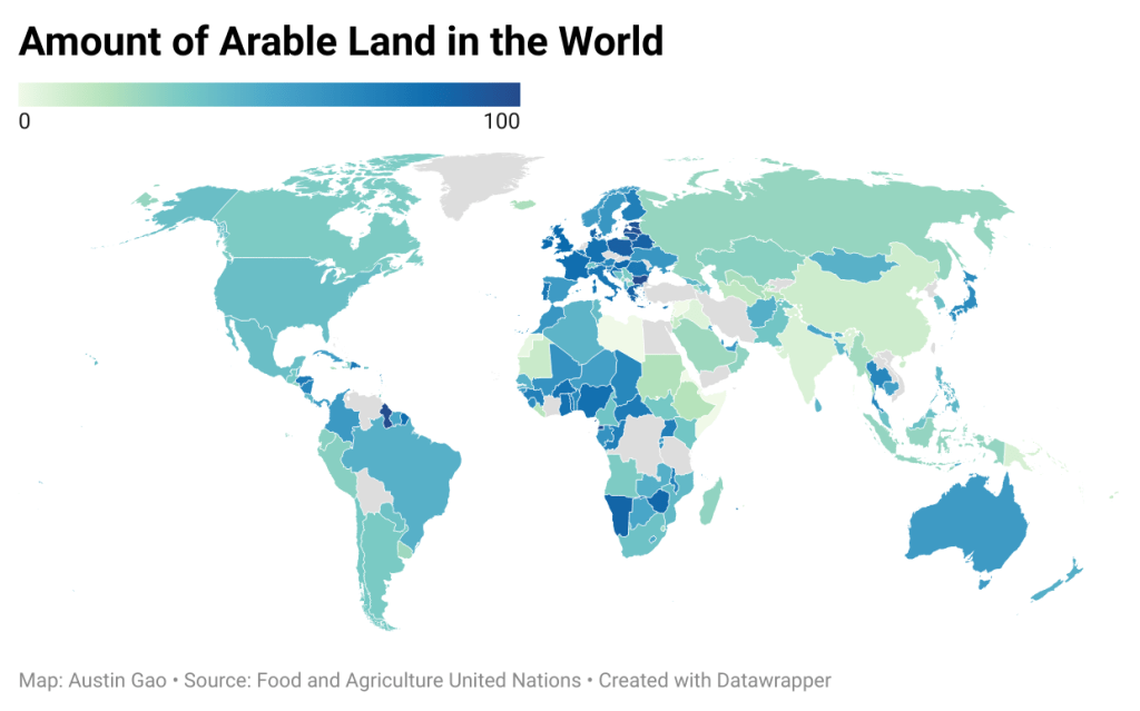
A Chloropleth map is primarily used to represent data variables such as densities, ratios, rates. An example of this map is the visualization of COVID-19 which showed the entire map of the United States and how dense the covid cases were depending on which county you hovered over on the map. For my example, I wanted to focus on the amount of land vs arable land that each country had. As a visual learner, it was fascinating to put all of this data into a visual form and it helped me see the bigger picture much better.
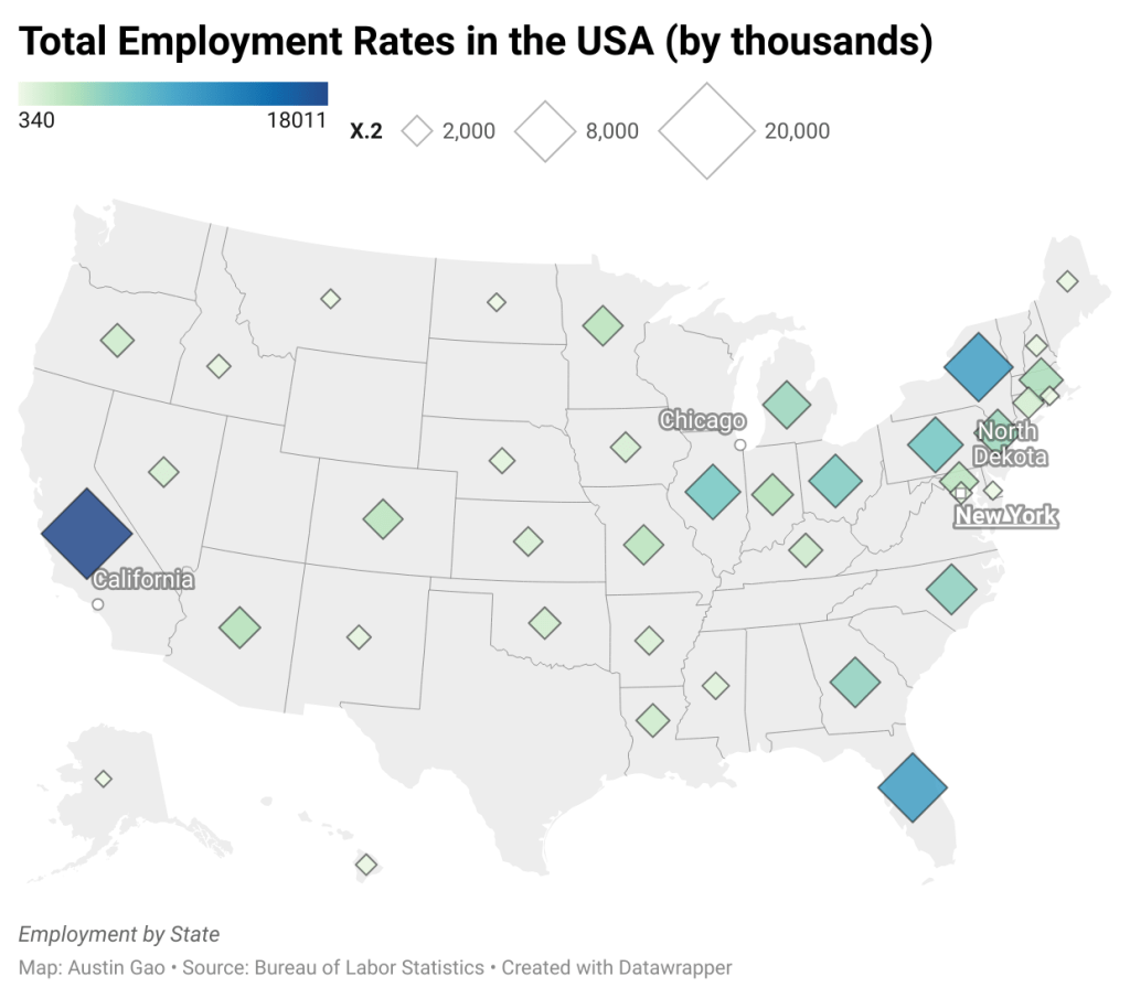
A Symbol map is interesting as it plots the value of the data variables proportionally depending on the kind of data you have. A famous example is the infamous election map which turns either red, blue, or a purplish color depending on the winner of election in that state. For my first symbol mockup in Datawrapper, I decided to highlight the Total Employment Rate across the United States for every 50 States. This map gave an excellent visualization of how many people are employed in every part of the country.
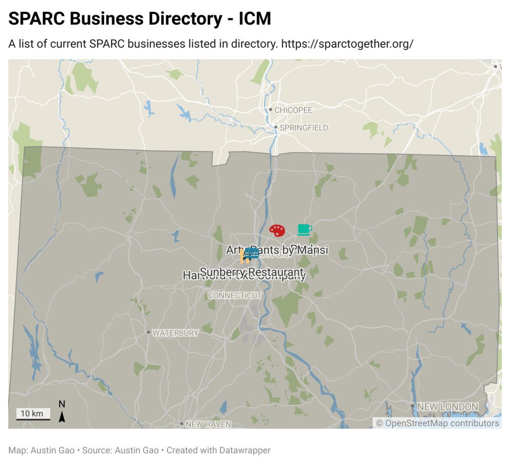
A Locator map is unique as it helps us find direction to certain points of interest. Google maps is an infamous tool that has the ability to get you from your location to anywhere else in the world. For this example, I wanted to create a map that highlighted many of the wonderful businesses that are included in the SPARC (Supporting Pan-Asian Resources Collective) Directory. This map could serve as a great tool to see what business might be in the area to go and support. Having the locations mapped out on the state of Connecticut is ideal for this type of directory and data as it makes it easier for users to see what is in the surrounding area.
After building out these three initial maps, it’s clear to me that maps are extremely powerful tools. It was fascinating to build a map of my own and to see with my own eyes that maps are not objective truths. They are simply a tool to use and to tell a story. As I venture on to 2nd drafts, I’m looking forward to enhancing these maps even further.

Leave a comment