
In 2016, two information designers (Giorgia Lupi and Stefanie Posavec) decided to showcase and visualize data from their everyday lives by drawing them on a collection of postcards. Even though they lived across the pond from each other, Giorgia and Stefanie were able to learn an extensive amount about one another each week through these postcards. The data showcased ranged broadly from a week of complaints to even a week of tracking what type of doors each of them walked through. Contrary to traditional data sets, each of these postcards contained hand-drawn illustrations which brings a more personal and less analytical feeling to data. Most often, data is represented in a “Everyday Data Viz” way. But displaying data through more abstract means brings a new light to analysts and the ways in which we interpret data.
My Dear Data Project:
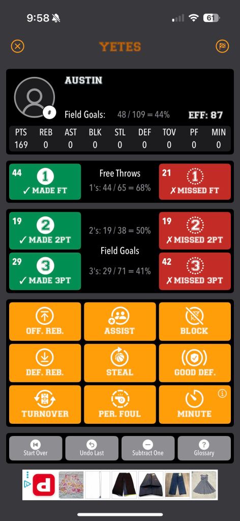
For my first attempt at making my own version of a Dear Data postcard, I honestly found it quite challenging. Since one of my recent hobbies has been playing basketball, I figured I could find and record massive amounts of data within a basketball session. During the 2024-2025 NBA season, NBA players averaged 36% 3PM (3-pointers made) and 78% Free Throws made. For this visualization, I wanted to see how large the gap was between a basketball player of my caliber compared to a professional. After deciding on a topic, I had to figure out what specific questions I wanted to answer.
Here is what I came up with:
- How many shots were made? (3pt, mid-range, free throw)
- Missed?
- Airball?
- Wedgie?
- How consistent was I?
- How often did I feel hot or ice cold?
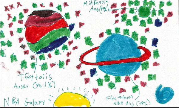
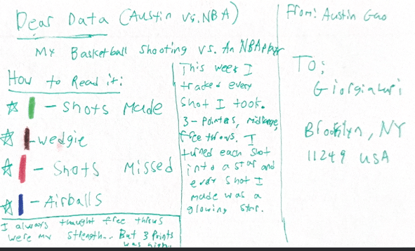
As I began this experiment, I realized that recording the data wasn’t the hard part for me, it was the aspect of thinking about the data in a more abstract way and finding a new way to visualize that took me the longest. To record all of my data, I used an app called Basketball Simple Stats and asked my girlfriend if she could keep track of all of the shots I took during the game. The app made it easy to track a shot with a click of the button and afterwards I was able to log down notes about the game as well. After thinking back and forth about it, I landed on a data visualization of “NBA Planets”. For a whole week, I tracked almost every 3-pointer, mid-range, and free throw I took. To put the shots onto paper, I turned each shot into a star and made them glow depending on if it were a miss, a make, an airball, or a wedgie. The results surprised me as I thought I’d shoot a better percentage on free throws since that was my strength but I actually shot a better 3-point percentage. As each of the stars surround the different planets: TreyTaris (3PT), Midrangia, and FreeThrowon, it was interesting to see the amount of shots I took for each. Overall, I found this exercise to be a lot of fun! It was interesting to think of a way to visualize data in a whole new light.

Leave a comment