Humans like simplicity. Plain and simple. Throughout history, humankind has made an effort to explain complex concepts by designing and creating easier-to-read graphic information. Due to the mass amounts of data that can be collected, it’s imperative that a designer take the raw numbers and convert them into a story/visualization that makes it easier for people to understand and process.
One of the most notable examples of Data Visualization comes from Charles Joseph Minard, a french civil engineer who is best known for creating one of the oldest data visualizations depicting Napoleon’s losses due to factors such as weather, direction of travel, and much more. Considering that the year was 1812, this was a complex illustration that was completed and improved readers comprehension significantly. Before we go any further, it’s imperative that we review what Data Visualization actually is, the pros and cons of its technological advances and the importance of visualization in general.
What is Data Visualization?
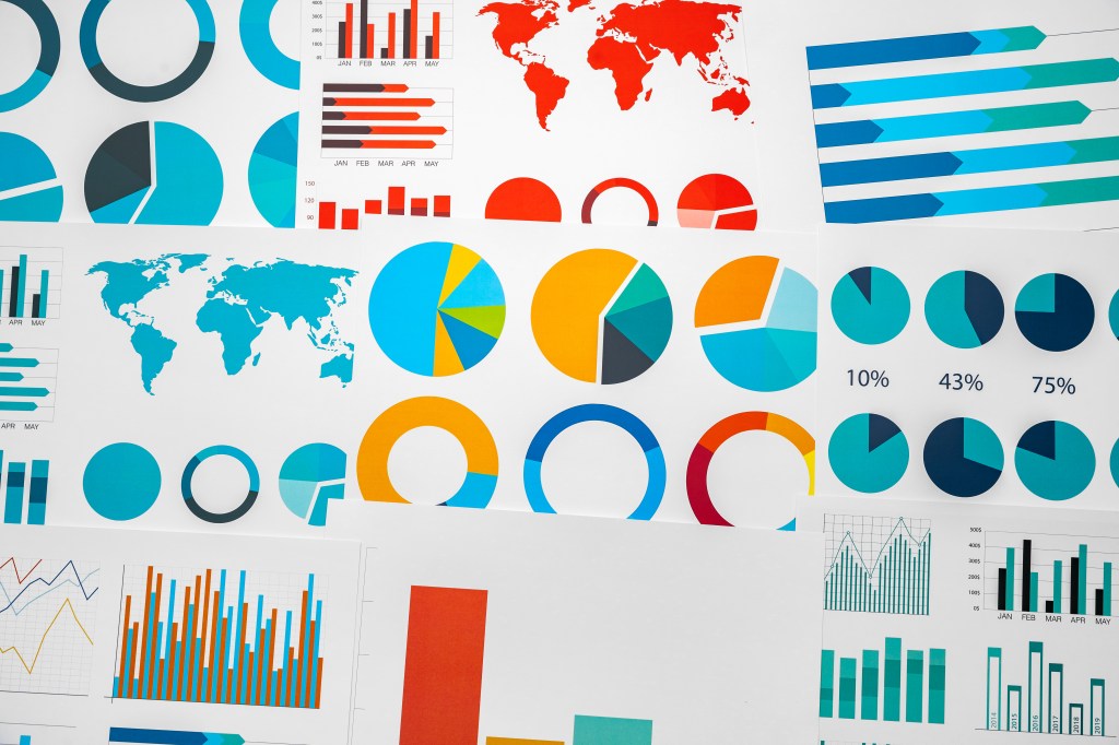
According to Heavy.AI, data visualization helps humans understand concepts by providing a graphical representation of data. What normally can’t be seen with a naked eye, can suddenly be illustrated via data visualization. Data Visualization is an effective way in universally sharing complex concepts that are otherwise difficult to convey. Some simple examples that come to mind are pie and bar charts.
Data can be visualized in several ways based on the kind of information that is provided. For example, when John Snow developed a map to determine where the Broad Street Cholera Outbreak was strongest. He used quantitative data to see which areas had the largest population of Cholera. After developing this map, anyone looking to understand the gravity of the outbreak could now visualize and understand the situation.

Pros and Cons of Technology
As Michael Friendly mentions in his book“A Brief History of Data Visualization”, there are several tools that were developed in this last quarter of the 20th century in terms of technology. Technology has allowed for several software tools to develop and provide data visualization items with more options to be interactive and dynamic. Compared to Minard’s visualization in 1812, the ability to create a visualization is practically instant with the introduction of computers. Computers allow us to access these visualizations from anywhere with anyone, and some of them even allow users to explore data dynamically by providing features such as real-time dashboards.
Unfortunately, with the introduction of more tech comes more features and complications. Although many of the modern visualizations can be built quickly and include a multitude of data, it is easier to over complicate the visuals and make it more confusing for the viewer. Also, the overreliance on computers can also lead to a lack of creative thinking due to software constraints or aggressive pushes to present data in a “certain” way.
What Makes a Good Chart?
To build a good chart, first and foremost the data has to be accurate and updated. Without accurate data, the graph could show incorrect patterns and simply show a visualization that is not true. The ideal chart should be clear, purposeful and easy to understand. As I learned from Edward Tufte in “The Visual Display of Quantitative Information”, graphical display should show the data, induce the viewer to think about the substance without distorting what the data has to say and ultimately serve a clear purpose.
Some of the aspects that I think come in a good chart are labeling clearly, using colors that are purposeful, and a clean layout. A great chart to view as an example is this COVID chart from VOX. To display those crucial numbers state-by-state is no easy task. In this example, the chart clearly shows what the data is trying to achieve, a clear distinction in color between the “tests per million people” versus “population”, and two simple columns. Building a good chart takes time, effort, and a true understanding of the data that is being presented. If the visualization is misinterpreted, that could result in a total misunderstanding from the user’s perspective and result in the messaging not getting across.

It’s clear that as society has grown, the importance of data visualization has grown at the same time. As data continues to get more complex, it’s crucial that we have people who have the ability to turn raw numbers into a story and a design that is both clear and purposeful. With the introduction of AI, the possibility of more and more specific points of data to be visualized is endless and can be created with a click of a button. As technology continues to progress, it’s important to keep visualizations easy to interpret and to remember who these visualizations are built for: Humans.

Leave a comment