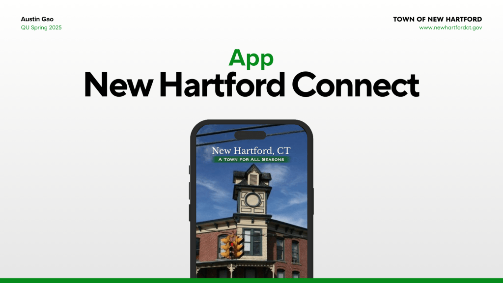
In the final two weeks of the Ideation, Prototyping, and Testing course, a plethora of things need to be implemented. Feedback needs to be digested, changes need to be made from previous versions and further higher fidelity prototypes need to be built. Compared to the low-fidelity sketches that were made and tested a few weeks ago, high-fidelity and medium fidelity prototypes include more realism, higher details, and functional prototypes. The detail, accuracy, and realism of a prototype varies significantly based on the phase you are at on a project. When working on a product, prototyping helps designers provide a proof of concept that a design works as intended and determines if real users are able to use a product or not. After working and testing the first low-fidelity prototype of the New Hartford Connect app, an app designed for the residents of New Hartford to access the town’s services easier. It was finally time to expand on the feedback that I learned from performing user tests and revamp the design even further.
Places and Tools to Design a Prototype
In 2025, there are several online tools that make prototyping more seamless and intuitive such as Adobe XD, Figma, Webflow, Marvel, and Axure. Personally, the tool I chose to primarily build my prototype on is Figma due to my previous experience working on the program. With only two weeks to build a high-fidelity prototype, I chose the program that I believed I could achieve the most in. Figma is an entirely cloud-based vector design tool which makes it easy to access, collaborate, as well as design prototypes! Although it may seem a bit challenging to work through at first, with enough practice, I believe anyone can design on Figma. Another bonus to Figma is that its base plan is free compared to some of its competitors which don’t have a free version at all.
Utilizing Feedback and Making Revisions
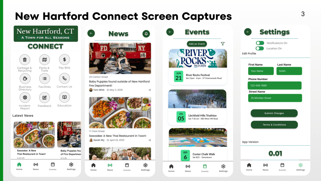
Considering the user feedback I received through the user tests, I decided to make some significant changes to the prototype as I increased the fidelity. Both of my users expressed that they had difficulty getting back into the home screen after completing the user scenarios. So to counterbalance that, one major change was the addition of a bottom nav bar which included the 4 main categories that would be important to this app. (Home, News, Event, and Settings).
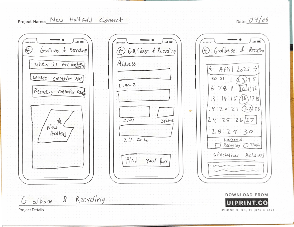
Also, because my original sketches were so basic. It left a lot to be imagined when designing a high-fidelity prototype. Many of the elements that I included in my sketch appear more defined in this latest version, even though the basic structure remains the same. Using many of the design assets that were already incorporated onto the Town of New Hartford’s website, I was able to make the app feel familiar yet fresh at the same time. Since I decided to add an account creation login step to add more inclusivity, there were more user flows to generate and steps to rethink.
Developing prototype screens for New Hartford Connect
For this version of the New Hartford Connect Prototype, I decided to focus on the main bottom nav tasks (Home, News, Events, and Settings). After completing those primary pages, I took some time to build out some of the other action pages that could be possible with an app like New Hartford Connect.
Another great experience was to create all of the actions and prototype steps onto each screen. Making each page more clickable really helps visualize the product even more and results in even stronger feedback. I also had a great time including real details about the town and adding images that would fit with the concept of a New Hartford App.
Feedback and Reflection
Overall, this project has been enlightening! Who knew that even a small and rural town like New Hartford could utilize an app with so much content.It’s been a pleasure taking the time to rework the current website’s Information architecture, build a new sitemap, as well as envision what a potential app could look like!
My favorite part of the process was working when we finally got to work on a more higher-fidelity prototype. As someone is more of a visual learner, I’ve always found designing to be an enjoyable experience and seeing a functional prototype in the end gave me confidence.
This Ideation, Prototyping, and Testing course felt like a sprint. Each week was exciting and brought a new phase of the UX process to life. Although the course was only 7 weeks, I feel that I have left with a newfound experience and will continue to explore ways to make a product better.

Leave a comment